原文链接有删减
是么是grid layout
This CSS module defines a two-dimensional grid-based layout system, optimized for user interface design. In the grid layout model, the children of a grid container can be positioned into arbitrary slots in a predefined flexible or fixed-size layout grid. CSS Grid Layout Module Level 1
发展
从2012年的第一版草案到2017年的正式标准经历了5年的发展。
基本名词解释
- 网格容器(Grid Containers)
- 网格单元格(Grid Cell) A grid cell is the intersection of a grid row and a grid column
- 网格轨道(Grid Track) it is the space between two adjacent grid lines
- 网格线(Grid Lines) Grid lines are the horizontal and vertical dividing lines of the grid
- 网格区域(Grid area) A grid area is the logical space used to lay out one or more grid items
代码示例
一段基本的布局:
把wrapper设置为 grid 对应的css:
我们将会看到,对布局并没有什么影响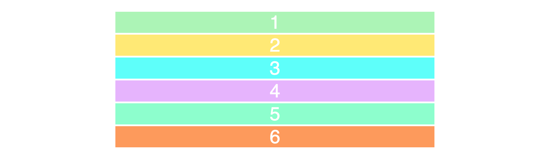
要产生二维布局空间,我们需要定义行和列,我们将会用到. grid-template-row 和 grid-template-column 属性。
我们就会得到一个两行三列的布局如下图: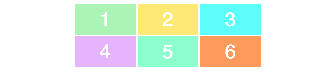
注意:部分CSS样式没有和布局无关没有体现
为了确保完全理解值和实际布局的对应关系,我们修改一下css代码
你看到的是修改过列和行的宽高的布局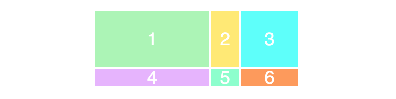
接下来我们创建一个3*3的网格
你将看到如下的布局,为什么没有三行呢?因为 html 里只有6个div。
类似合并单元格的效果(通过网格线定位)
|
|
布局将会变成如下的样子,第一个单元格占据了三列的宽度
网格线(Grid Lines) 可以明确的看到网格线的编号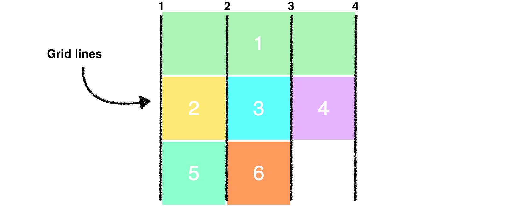
结合行的网格线来调整布局
看到最新的布局如下图
浏览器兼容性
76.92% 的浏览器支持这个属性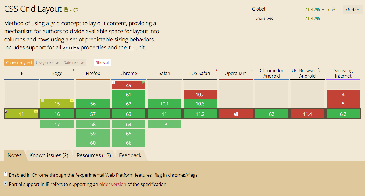
注意事项
- 不会脱离文档流
证明:脱离文档流会开启新的BFC,如果父元素不做任何处理会出现高度塌陷的问题,通过实验父元素高度没有塌陷。 - 不支持的属性,由于不是
box container而是grid container所以部分属性不再支持
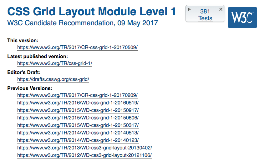
CSS Grid Layout Module Level 1
多列布局模块中的所有column-*属性运用在网格容器上将失效float和clear使用在网格项目(网格单元格Grid Cell)上将失效vertical-align使用在网格单元格上将失效::first-line和 ::first-letter这样的伪元素不能应用在网格容器上
参考资料
CSS Grid Layout Module Level 1
Learn CSS Grid in 5 Minutes – freeCodeCamp
How to prototype websites quickly with CSS Grid – freeCodeCamp
How to make your HTML responsive by adding a single line of CSS